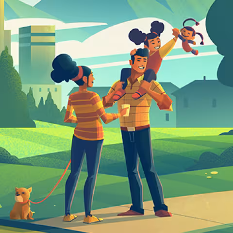
This month, we caught up with Colorado artist Brian Miller, an illustrator whose portfolio spans brands from REI to Disney and the creative force behind Power Ahead Colorado’s visual identity. His illustrations bring heat pumps to life by celebrating the spirit, landscapes, and communities that define Colorado.
Heat pumps can seem invisible or unglamorous as a technology. What artistic choices helped make them feel appealing to the audience?
The key was not to spotlight the technology itself. While heat pumps were a vital component, the real focus was the environments, neighborhoods, people, and scenic landscapes of Colorado. It was less about showing the physical technology and more about showcasing the functionality it brings to the places where it exists.
Your work often taps into emotion. What feelings did you want to spark for audiences encountering the Power Ahead Colorado campaign?
The feelings, emotions, and themes I chase most often in my work can be captured in a single word: hiraeth. From my understanding, hiraeth is a Welsh word that describes a longing for home, a feeling, or a time and a place which we wish to visit but no longer exists (or exists only in memory). It is a longing deep within our soul for a home which we cannot get to, a time which has passed, or a place we wish to return to; it has been the focus of my work before I ever understood the idea.
Were there themes or goals that influenced your color palette or aesthetic direction?
Interestingly enough, the overall color palette was established by the fine folks at Karsh & Hagan based off illustration work I’d done in the past. This meant that the colors they chose were already familiar to me; it helped take a lot of the guesswork out of the overall direction of my explorations. With the basic swatches in hand, I worked to integrate the colors into each scene so the backgrounds felt warm and inviting. My goal was to create a world I would want to step into and my hope was others would feel that as well.
Were there any unexpected challenges during the project? How did you overcome these hurdles?
The biggest challenge with any project I take on is creating the best work I’m able to given the unique set of variables I’m working with. I pour myself into every piece I create because the work itself, what I’m creating, is the one thing uniquely resting on my shoulders. Client needs, creative briefs, timelines, project requirements - all of these things create the boundaries I’m given to create within. Once those are set, it is up to me to give everything I’m able to the work itself.
If the campaign illustrations had a personality, how would you describe them—and why was that right for the audience?
My goal was to make the personality of the campaign illustrations match the look and feel of the landscapes and neighborhoods found uniquely in Colorado. It was less about capturing what a specific neighborhood looks like and more about capturing what living in neighborhoods in Colorado feels like. We’re blessed with wide open skies, stunning mountains ever present in the west, and a vibrant community of those who call Colorado home.
How did Colorado’s climate, homes, or communities influence your visual choices?
Being born and raised in Colorado, nearly every aspect of my art is impacted by the landscapes I’ve seen since I was old enough to form memories. I’ll paint mountain scenes or chase a specific feeling of a sunset only to realize when I’m finished that there was some memory I had that made its way onto the canvas. My family has been here for generations and there’s a feeling of connectedness and home which I feel deep in my soul. I’m grateful to live in Colorado and I hope my work reflects that gratitude and has a positive impact on anyone who sees it.